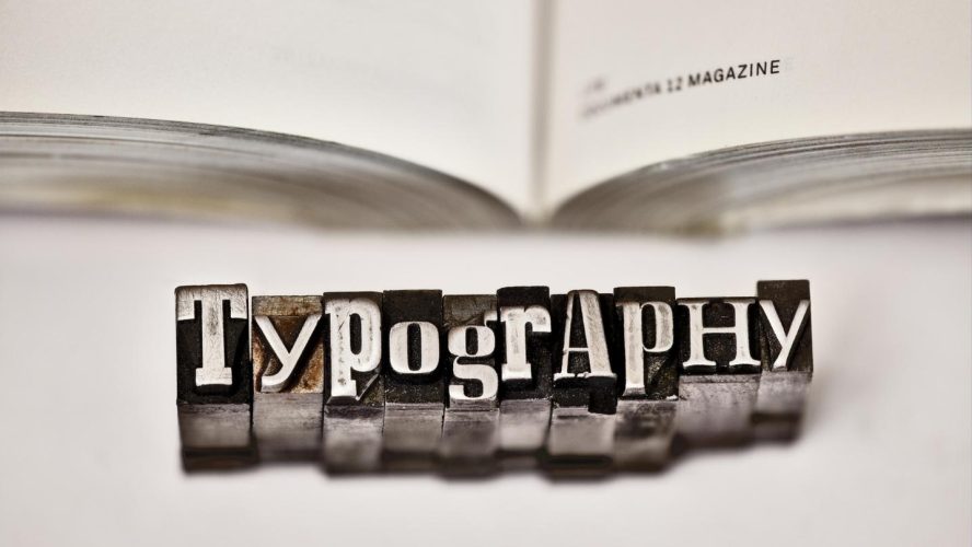
Typography is one of the most important elements of graphic design – so critical, it could actually make or break your marketing efforts. Here are some typography tips to help keep you safe and heighten your web design…
First things first. If you can’t read it, it’s worthless. Choose readable fonts, hyping selling points with larger, bolder type. Also keep in mind that contrast is key to readability. So, use colors to your advantage instead of your deficit. For instance, a thin, white type font placed over a pale yellow or beige background would be very hard to read. Whereas fonts in darker, bolder colors atop light colored backgrounds make for easier reading.
Respect font families, limiting the number of font variations you use and choosing fonts with a cohesive feel so that your design doesn’t appear disjointed. It’s also good practice to attract attention with your primary typeface and use a complementary typeface with a bit less splash (so you don’t overdo it) for your subheads and body copy.
Additionally, too much of a good thing is not such a good thing, meaning – in this instance – that a copy-heavy page is harder to read, as well as less appealing to read. You don’t want your audience glazing over or avoiding your copy altogether. If you want to get someone’s attention, use clear, succinct typography and remember that white space is not a waste of space. It can actually frame your type and draw the eye to it.
When it comes to typography, alignment is also important. Did you know that left justified copy is easier to read than centered type? Also try to avoid widows (type at the end that jumps to the next column), keeping your columns of type as clean as possible.
Don’t forget to have fun with typography, working whimsy into your design with playful fonts or elevating the look and feel with a more elegant typeface.

